Designed to reflect the technical side of online learning. The circuitry within the various devices used to connect to online learning platforms.
We call it the ‘Node’ icon.
Click the logo below to download a high res digital version in .png format.
The logo should always be presented prominently. Adequate space should be allowed around the logo so that it is legible and clear.
The clearance zone has been specified to keep the logo clear of other graphic elements e.g. photographs, text and illustration to provide stand out and clarity in all applications.
Whatever size the O of Online is when your logo is in position use the O to guide your logo clearance size.

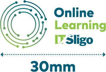
The minimum that the logo should be reproduced at is 30 millimeters.
The following Online Learning IT Sligo logos are for different applications. You should always strive to use the colour in it’s full CMYK/RGB version but this is obviously not always possible especially on photographs and illustrations.
The preferred way to use this logo is on a white rectangle in order to lift it from a solid colour or imagery. Left or right works depending on the layout application you’re trying to achieve.



Distort or stretch the logo. Always use it 1:1 ratio.

The colours used in the logo are the same colours used in the current IT Sligo logo. The reason for this has come from a willingness to retain the familiar look and feel of what the IT Sligo brand has achieved since this logos inception in 2009.
The ‘Node’ icon in the logo is a gradient made up of these two IT Sligo colours. The angle of the gradient should always be kept at -1150.
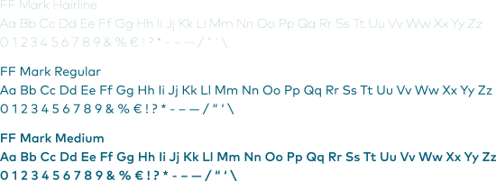
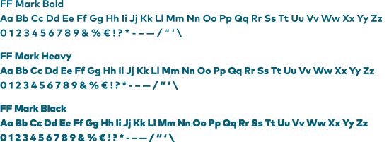
The font we use is called FF Mark. It is a contemporary and clean sans serif font.
We recommend using a range of weights in order to bring life and contrast to your various communication.
Use uppercase and lowercase for various headers and subheads as you see fit.
